
🚨 Update;
Toggle Component.
Included Features:
☑️ 126 Variants
☑️ 3 Components: Toggle, Toggle Label, Toggle Card.
☑️ 3 Sizes: Small, Default, Large.
☑️ 7 Types: Default, Feature Icon, Toggle, Brand, Avatar, Company, Payment.
☑️ 2 Directions: LTR, RTL
☑️ 5 State: Default, Hover, Focused, Selected, Disabled.
☑️ Interactive Prototype.
Sign up for early access!
brixui.com
0:00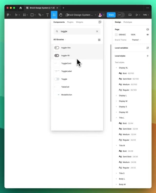
0:00 / 0:00